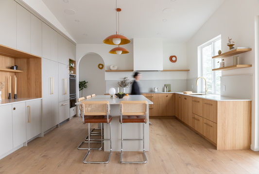
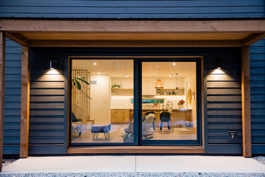
Marrying the classic wood focused aesthetic of Mid Century with a relaxed minimal footprint, this family townhouse in North Vancouver emerges from it's cramped beginning into a light filled, joyful space.
When the homeowners purchased this townhouse, the kitchen was sad, cramped and segregated from the rest of the home. It was a no brainer that the walls had to go, and once they did, light from the full wall of windows to the garden flooded in.
The original layout was a hindrance to the overall flow and functionality of the day to day of a young family. The compartmentalized layout created barriers to having more than one person in the space at a time, and for a family that lives, works, and entertains at home, that was not cutting it.
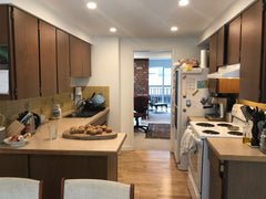
The not-so-joyful before
Studio Hemma's shared love of MCM philosophy shines through the tactile finishes curated to create a warm, open, family oriented space.
With the walls removed, design partner Studio Hemma was able to add a non-existent island taking full advantage of the existing light from the garden while providing a generous work top for cooking, homework and entertaining. Wrapping the perimeter of the kitchen in the warmth of Shinnoki's Natural Oak provided an abundance of storage previously missing while rooting the kitchen in the MCM style the homeowners were searching for. A key issue to content with was an existing quirky pass-through that had to stay (it brought light into the adjacent office space) along with a bump out that couldn't be removed. Studio Hemma opted for the less-is-more approach and pushed for the wall to become a feature vs adding the visual clutter of more cabinets. Now, the terracotta tiles align with the natural palette Mid Century Modern design is known for while adding both texture and interest to the space.
"The 3-dimensional terracotta tiles used counter to ceiling gave us a tonal focal point all while helping minimize the visual chaos of the fixed existing features. Plus, they're fun and brought serious Mid Century vibes."
- Studio Hemma
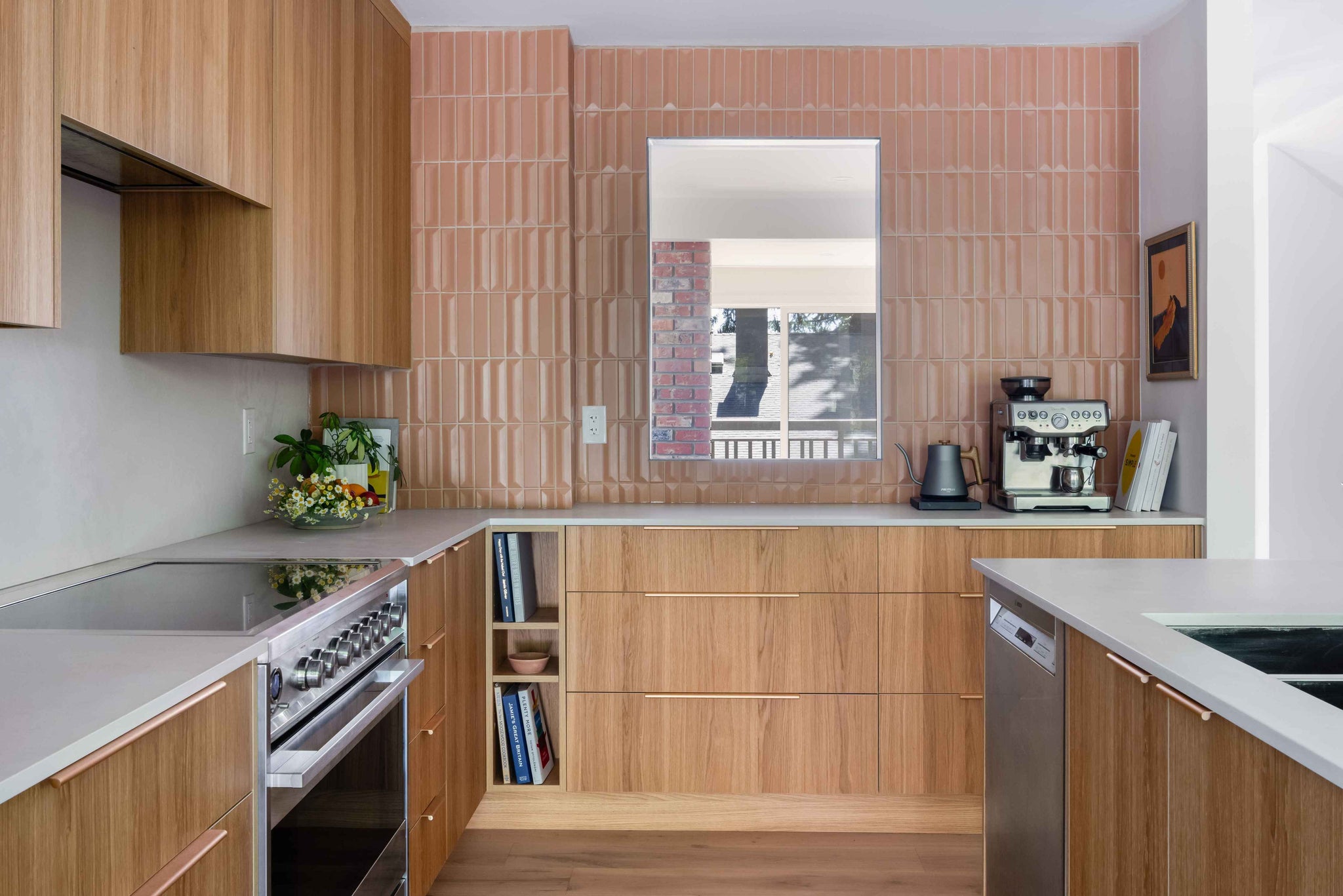
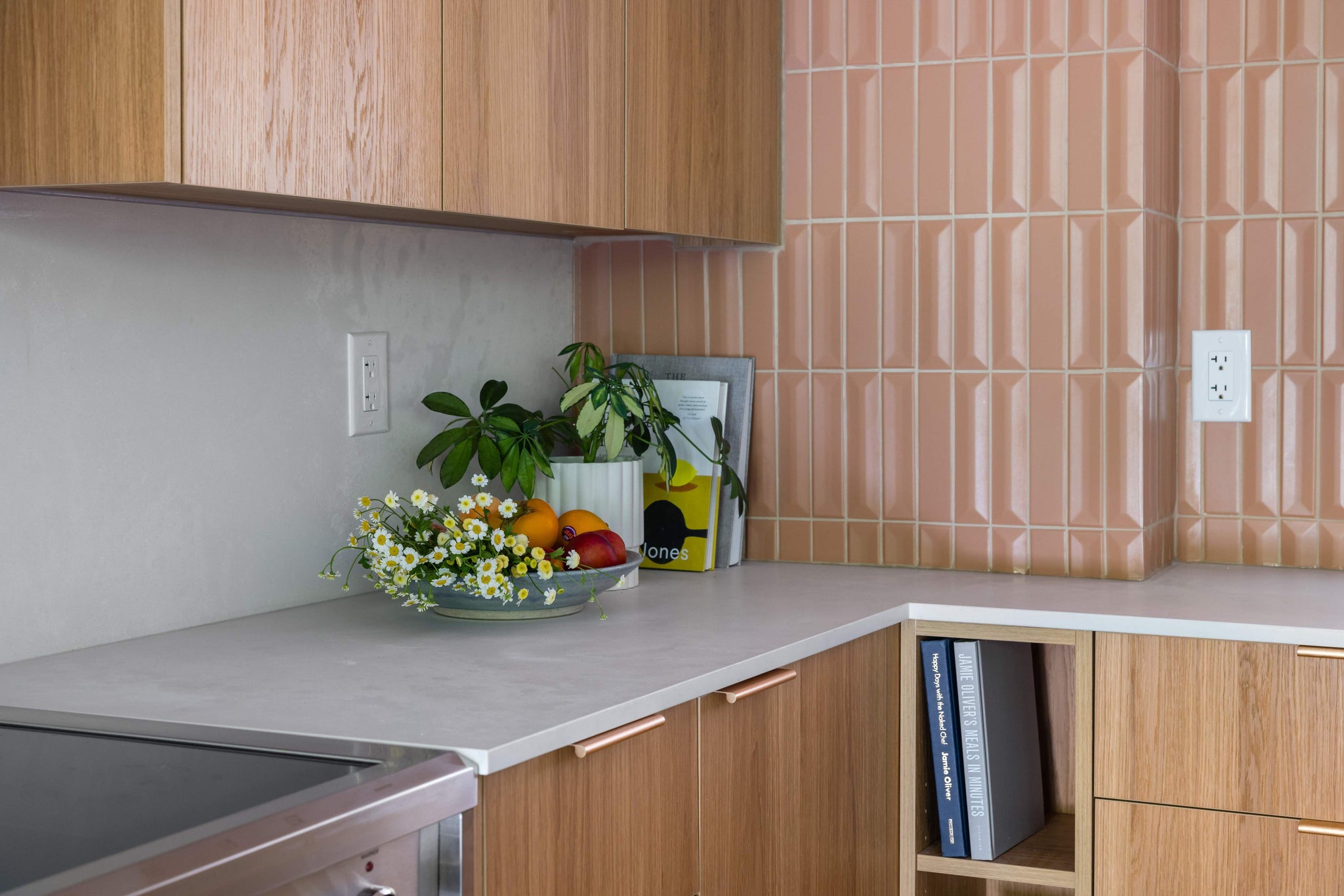
Playful dimensional tile creates texture and warmth
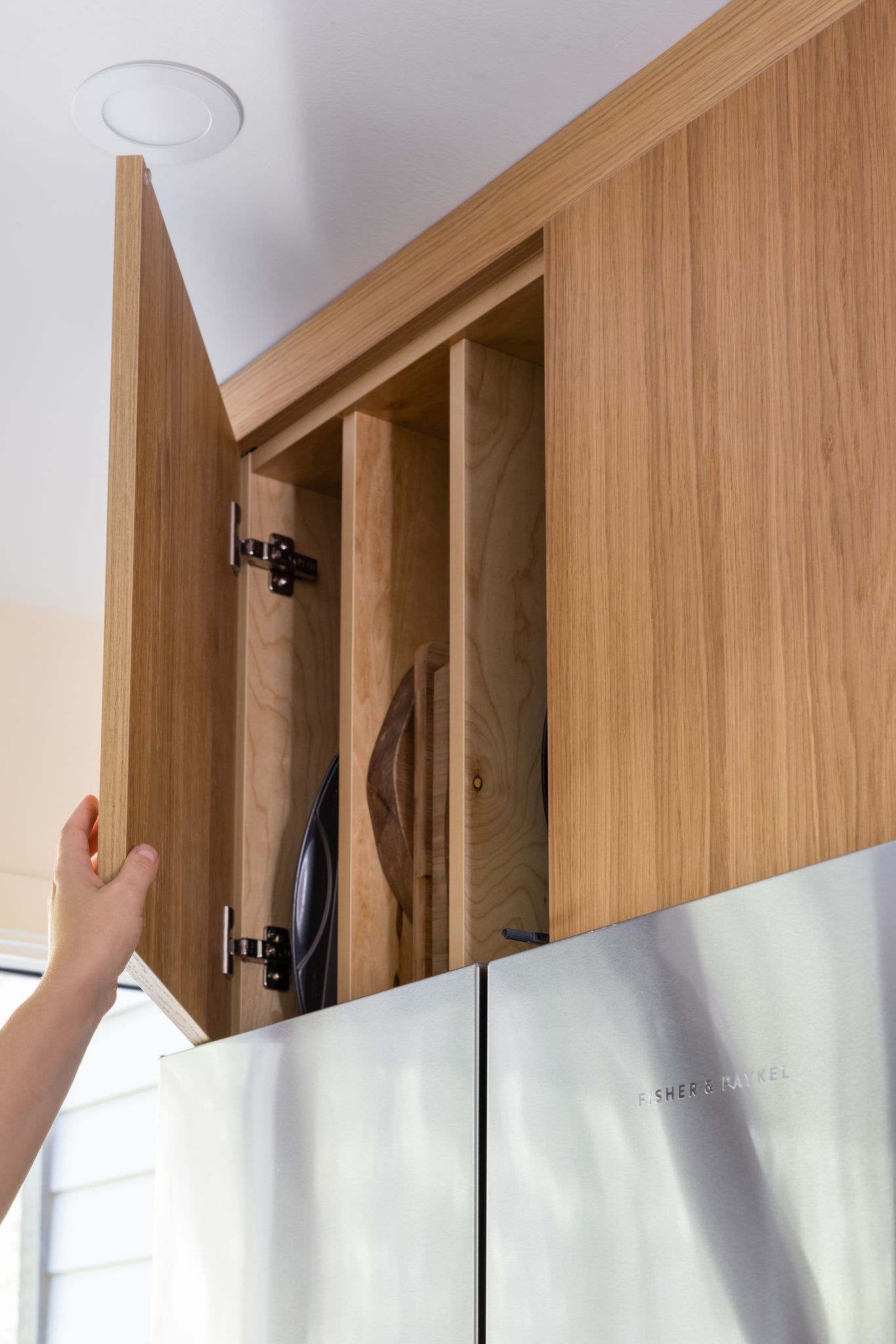
Both warm and spacious, our Lynnmour project's revitalized open layout now promotes gathering. Offering seating for three at the island and an open coffee bar area inviting you to cozy up with a warm cup of jo. Thoughtful consideration was taken to incorporate dedicated cookbook storage that was easily accessible while cooking as well as a functional home for the client's cutting board, serving dishes and cooking pans. This was secreted away above the fridge to keep them close while not wasting high-traffic storage needs below.
Studio Hemma was careful to consider elements inherited with the original design of the townhome such as the existing wooden panelling of the dining room in what is now an open plan. Ultimately, the homeowner's goal of a Mid Century style kitchen was balanced with the more minimalist aesthetic of the West Coast by keeping the material palette neutral and focused on texture just as much as practicality. By pairing natural oak veneer cabinets with the visibly tactile finishes of the Caesarstone Cloudbusrt Concrete countertop and matching backsplash with the terracotta tiles, a fresh, calm take on a classic design style is formed. Add to that the whimsical and era-fitting light fixtures and furniture incorporated by the homeowners and you've got yourself a playful space for young family to live, grown and enjoy for a lifetime.
"We love the outcome of our vision that came to life through the amazing design guidance of Meaghan. Our kitchen feels so inviting and we know it will service us well for many years to come."
- homeowner
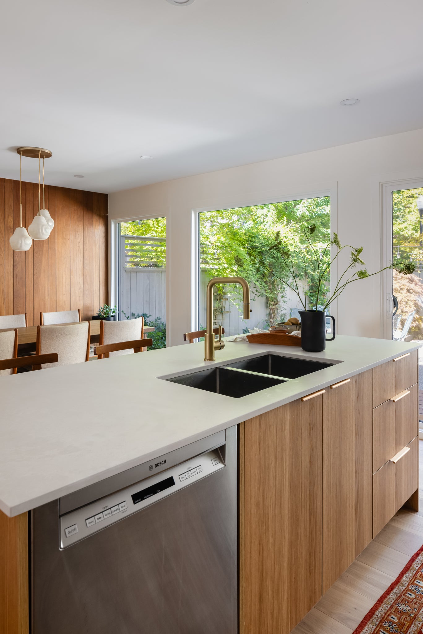
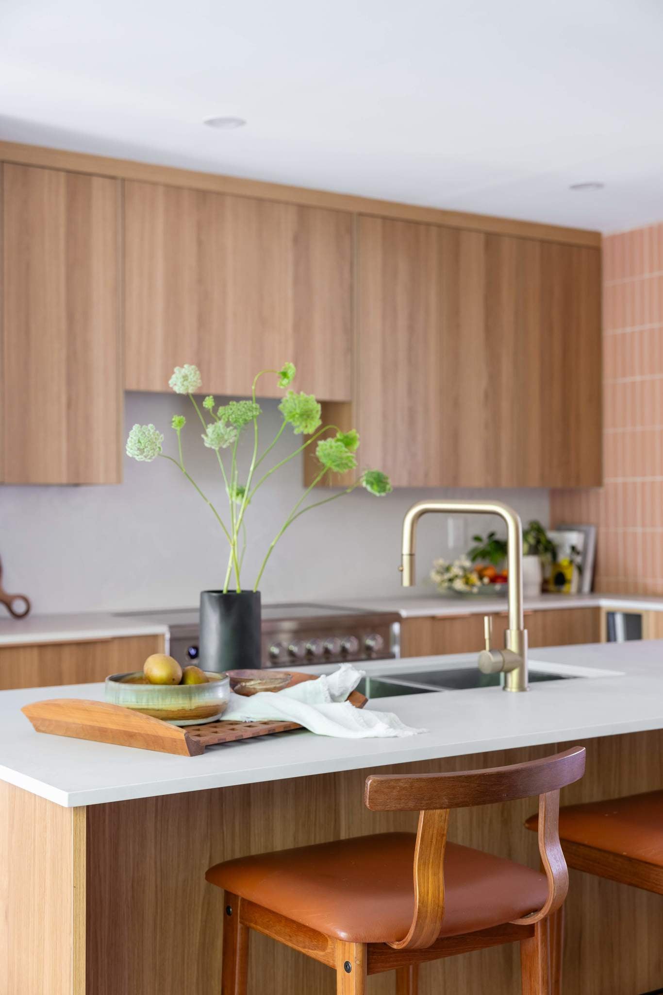
This warm Modern Mid Century space is a new take on a classic with it's masterful use of texture, a neutral palette and functionality.
See even more details of our Lynnmour Project in the original project showcase, here.
